 Office Solutions Pro
Fix nested scrolling in Power Apps forms with auto-height text
Make long responses easier to read in a canvas app by displaying them in auto-height Text controls, with optional visibility rules for forms that also support editing.
On this page
- Overview
- Before you start
- 1. Choose a layout for reading
- 2. Add a Text control inside the first card
- 3. Bind, position, and expand the text
- 4. Optionally switch between reading and editing
- 5. Finish one card, then repeat
- 6. Check the result and save the app
- Clean up controls carefully
- Troubleshooting and limits
Long responses can be awkward to read when each multiline input has its own scrollbar inside a scrolling form. Use a modern Text control inside each long-text data card, bind it to the card’s default value, and enable AutoHeight. The text can expand while users scroll through the form.
This approach changes how existing text is displayed. It does not change the data source or increase a field’s storage limit. The example is a SharePoint-backed project request app with a separate viewing screen.
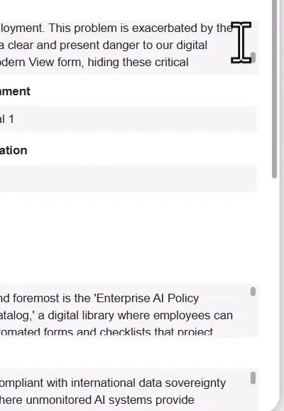
The original layout has separate scrolling areas inside the form.
Before you start
Open an existing canvas app in Power Apps Studio with permission to edit it, such as owner or co-owner access. You need a working form with DataSource and Item already set, long plain-text fields, and a scrolling area for the form. Keep a copy before unlocking cards.
For modern controls, enable Modern controls and themes in the app settings if needed. Modern and classic forms share the same underlying form model; see Microsoft’s modern Form control.
The SharePoint connector is Standard in Power Apps. Users still need the licenses and data permissions required by the complete app. Dataverse and other premium capabilities can require premium entitlements; see Power Apps licensing. A Text control does not replace data-source authorization.
You can use your own form. The project intake app and its character counter are examples, not prerequisites for this change. This procedure covers plain-text values; rich-text rendering needs a different design.
1. Choose a layout for reading
- Open the screen used to read an existing record.
- Keep the form in view mode. For an Edit form used as a viewer, set DefaultMode to
FormMode.View; for an existing mode-switching app, use its normal view action. - Keep short categorization fields compact. Give long narrative fields a full row where practical.
- Preview a record with long responses and identify the fields that require internal scrolling.
An expanding field can leave blank space beside it because cards in the same row share the tallest card’s height. A separate reading screen can work better than reusing a highly customized, multi-panel entry screen. See data-form layout.
2. Add a Text control inside the first card
- In Tree view, expand the form and select the first long-text data card, such as Business Problem.
- Insert a modern Text control into that card. Select Unlock and add if prompted. You can also unlock the card from its Advanced properties before inserting.
- Confirm in Tree view that the new control is a child of the intended data card.
- Keep the existing input for now. The example names it
DataCardValue49, its field-heading controlDataCardKey49, and the new Text controlText2.
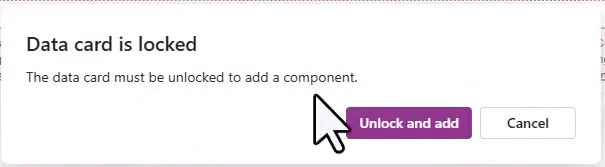
Unlock the card to add the replacement display control.
Unlocking gives you responsibility for the card’s formulas. You cannot simply relock it afterward; see working with data cards.
3. Bind, position, and expand the text
Set these properties on the new Text control. Adapt the control names and spacing to your card.
| Property | Example value |
|---|---|
| Text | Parent.Default |
| X | 24 |
| Y | DataCardKey49.Y + DataCardKey49.Height + 4 |
| Width | Parent.Width - 48 |
| Wrap | true |
| AutoHeight | true |
Copying the original input’s X, Y, and Width formulas is a useful starting point. The example leaves 24 pixels on each side; the 48 is layout spacing, not a platform requirement.

Place the Text control beneath the card’s field heading.

Keep the width relative to the current data card.
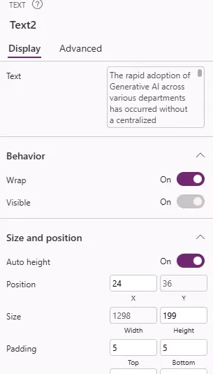
Enable wrapping and automatic height on the Text control.
Parent.Default reads the containing card’s value. It works here because the Text control is directly inside the correct card. These labels display card defaults, not a live mirror of unsaved edits. Microsoft’s data-card guidance explains this binding pattern.

Bind the Text property to the parent card rather than hard-coding a record field.
For a dedicated viewing form, set the original input’s Visible property to false and leave the Text control visible. Hide the input inside the card, rather than hiding the whole data card.
How the card’s height follows the text
The text can only expand if its data card expands too. Here is how the pieces fit together:
- The Text control. This is the modern Text control. With AutoHeight on, it increases its height when the text exceeds the visible area. Its Height includes its top and bottom padding, 5 pixels each in the example.
- The card. A data card grows when a control inside it with AutoHeight on gets taller, and every card in a row matches the tallest card. You don’t need a formula for the card to grow.
- The card’s own Height. A card stays at least as tall as its Height property. If the card was given a fixed height for a multiline input, such as
300, a short value leaves blank space below it. - Width. The narrower the card, the more lines the same text needs, so the card and its row get taller. On a narrow screen or a narrow card, reduce the
48so the text keeps a usable width.
To make the card shrink to short text in a dedicated viewer, set the card’s Height to the bottom of the Text control plus a small margin:
Text2.Y + Text2.Height + 8This formula assumes that Text2 is the Text control inside this card, placed under the heading as above, and that nothing visible in the card sits below it. The 8 is spacing, not a platform value. If the card stays taller than expected, check the Y of any other control in the card, such as the error message, that sits below Text2.
For a form that switches between reading and editing (step 4), keep the editing height when the form isn’t in View mode. Replace 300 with the card’s original Height:
If(frmRequestViewing.DisplayMode = DisplayMode.View, Text2.Y + Text2.Height + 8, 300)The editing branch doesn’t use Text2.Height, because while a Text control is hidden, its Height doesn’t update as the text changes.
Empty values. When a field is empty, the Text control shows nothing under the heading. To make that clear to the reader, set the Text control’s Text to:
If(IsBlank(Parent.Default), "No response", Parent.Default)4. Optionally switch between reading and editing
If the same Edit form supports viewing and editing, retain the original input and its save binding. In the example, the form is named frmRequestViewing; replace that name with your form’s name.
Set the original input’s Visible property to:
If(frmRequestViewing.DisplayMode = DisplayMode.View, false, true)
Set the new Text control’s Visible property to:
If(frmRequestViewing.DisplayMode = DisplayMode.View, true, false)
| Form mode | Original input | Auto-height Text |
|---|---|---|
| View | Hidden | Visible |
| Edit or New | Visible | Hidden |
The comparison uses DisplayMode.View with the form’s DisplayMode property. Use FormMode.View when working with Mode or DefaultMode instead. See form modes and functions and If syntax.
Keep the card’s Update formula connected to the editable input. Parent.Default on the display label does not save edits. Test your existing save/cancel actions and save successfully before expecting the viewing screen to show changed data.
5. Finish one card, then repeat
- Preview the first field with a long value and a short value. Confirm that it expands without overlapping the next card.
- Match font, padding, and background to the rest of the form.
- To reproduce the light gray background in the example, set the Text control’s Fill to:
ColorValue("#F5F5F5")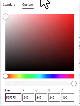
This is the example’s chosen background; match your own app theme as appropriate.
- Copy the configured Text control into each additional long-text card, unlocking cards as needed.
- Adjust each copy’s Y formula to reference that card’s own field heading. Check its X and Width too.
Parent.Defaultcan stay the same because each copy has a different parent card. - Hide each original input or apply the complementary visibility rules. Keep card bindings, validation, and input controls needed for editing.
Download the property formulas and application notes for the examples above.
6. Check the result and save the app
- Preview long responses containing paragraphs and line breaks. Scroll the form from top to bottom and confirm that converted fields expand without their own scrolling boxes.
- Try empty and short values, a second record, and the longest realistic response in your app.
- Check narrower screen widths, keyboard navigation, and the reading order of headings and values.
- For a mode-switching form, test View, Edit, and New, plus a save and a cancel. Check for overlap, missing inputs, and lost edits.
- Save the app. Publish the saved version when you want app users to receive the change. Microsoft’s sharing guidance explains the save/publish requirement.

Long sample responses occupy more space while the form supplies the main scrolling area.
Clean up controls carefully
Keep the original inputs during the initial conversion. Removing one can break formulas that still reference its position, height, or value.
If you later simplify a dedicated read-only form, find and repair every reference before deleting controls. For example, a dependent label positioned below the replacement control Text2_1 can use this Y formula:
Text2_1.Y + Text2_1.Height
Position dependent content using the replacement control’s height.
On a dedicated reading layout, the field heading and Text value may be sufficient. Remove obsolete required indicators or error labels only after checking that the layout no longer depends on them.
Do not clear a data card’s Update formula or remove validation controls on a form that can submit changes. If an Edit form is intended permanently for viewing, keep it in View mode with no submission path; a Display form is another supported read-only option. The data-card save model explains why Update matters.
Troubleshooting and limits
- The label shows the wrong value: Confirm that it is directly inside the intended card and that the card’s Default and the form’s Item are correct.
- Text clips or overlaps: Check Wrap, AutoHeight, the label width, the card layout, and any custom height or position formulas. Avoid leaving a fixed-height container around expanding content.
- Blank space below short text: The card’s own Height is larger than the text needs. See How the card’s height follows the text.
- The original scroll box remains: Check the original input’s Visible formula and whether you converted every long-text card.
- The field looks blank or has stale height after a mode switch: Check the installed modern control version, including any update notice, and retest after the Text control becomes visible. Microsoft documents AutoHeight fixes in the Text control updates.
- A large form loads slowly: Measure performance with representative data and target devices before removing controls. There is no field-count guarantee for this layout. Microsoft’s performance troubleshooting recommends profiling and reducing unnecessary resource use.
Test hidden-to-visible transitions with your longest values. This design improves the reading layout; it does not enforce read-only access to the underlying SharePoint list or other data source.
Companion video
Video: Fixing the "Nested Scroll" Problem in Power Apps Modern Forms
If the player is blocked on your network, open the video on YouTube.
Need help applying this to your own setup? Read about consulting.